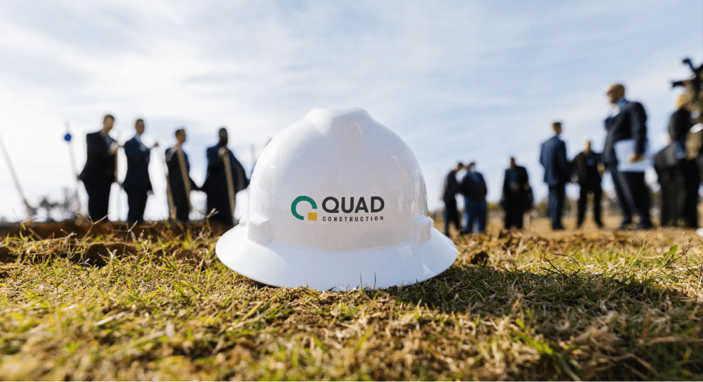
Brand System • Visual Identity • Print Design • Digital DesignQuad Construction
After decades of building its reputation, Smith and Pickel Construction was ready for a new chapter. The company had evolved, but its visual identity no longer reflected the quality, sophistication, and ambition behind the work.
The challenge was to create a more elevated brand presence that felt modern, polished, and confident while honoring the company’s established reputation.
In collaboration with Flight Agency-
Quad Construction had outgrown its existing identity. As the company moved into larger, more complex projects and began working with increasingly sophisticated clients, its brand needed to evolve with it.
The rebrand centered on a more refined and contemporary position, with a new name and identity built around collaboration. Quad represents the four key participants in the design-build process: the property owner, architect, contractor, and community.
-
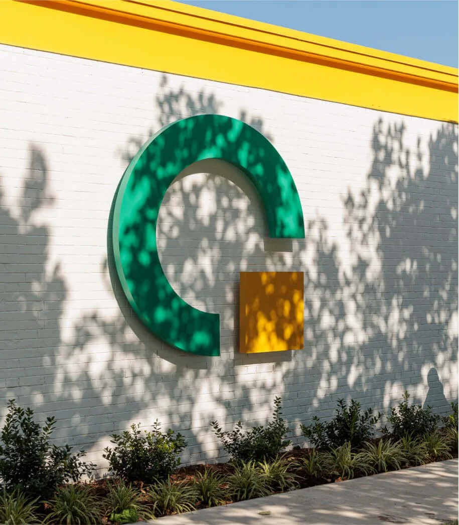
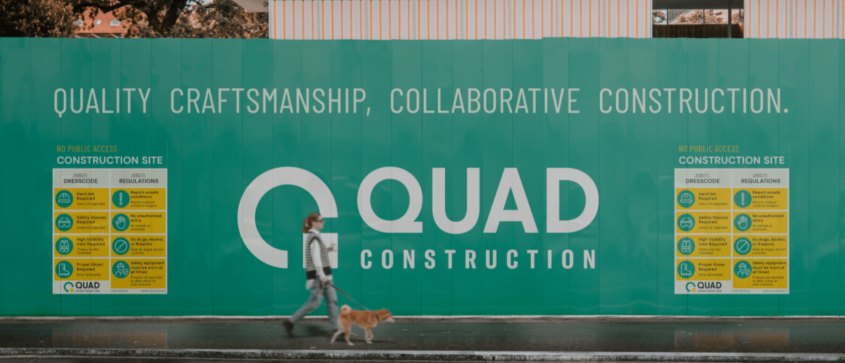
The logo translates the brand strategy into a simple, geometric mark.
Four corners form the foundation of the symbol, representing the four stakeholders at the heart of the design-build process. A curved green form surrounds the square, creating a "C" that represents renewal and forward movement.
Together, the elements form the "Q" in Quad, creating a mark that connects the company's history with its future.
-
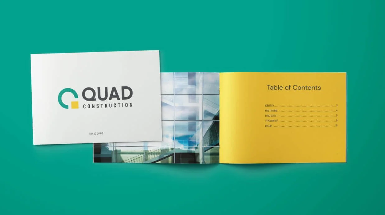
The visual identity was designed to feel sophisticated, architectural, and intentional.
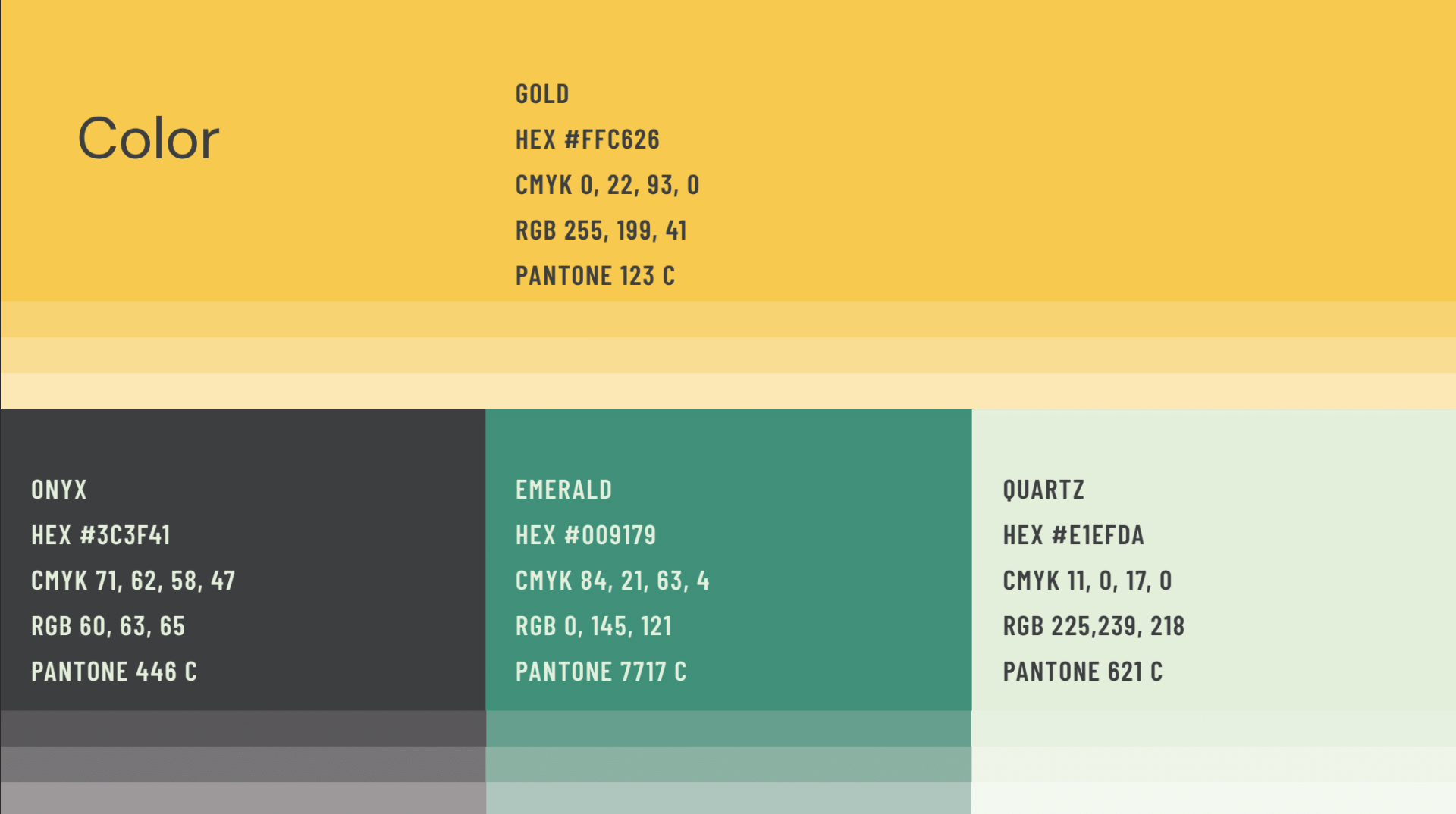
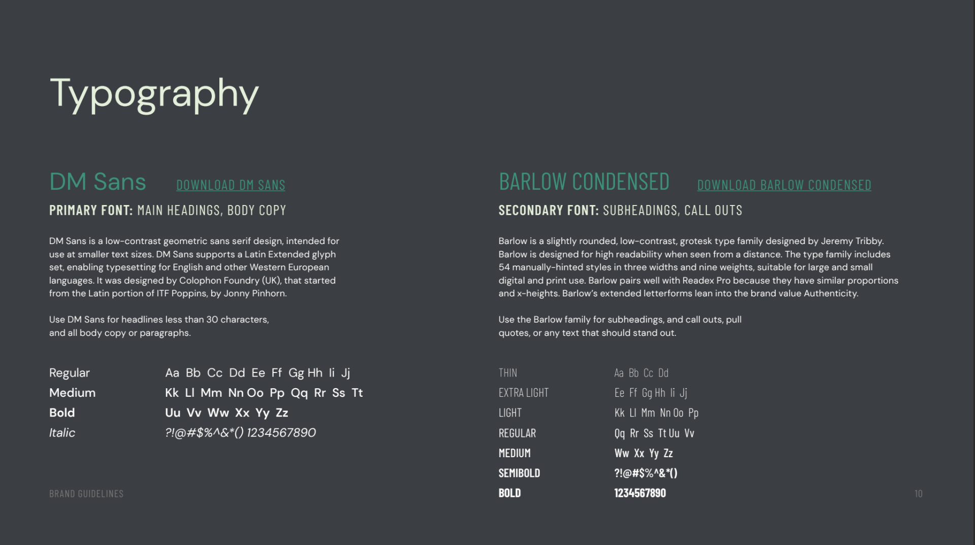
A restrained palette of yellow, green, and neutral tones builds on elements of the company's history while introducing a more contemporary feel. Geometric typography and precise line work reinforce the structure of the brand, while generous negative space creates a sense of refinement.
The system was intentionally minimal, allowing the company's architecture and project photography to remain the focus.
-
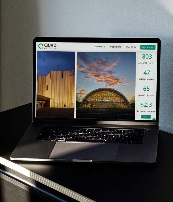
Following the launch, Quad Construction received prominent local press coverage that brought the company to the attention of new audiences, including investors and developers. The redesigned website also saw a 56% increase in organic traffic during its first week, extending the reach of the new brand beyond its visual identity.